Design to live faster with Framer
Figma has emerged as a leading tool for its versatility and collaborative features.
However, when managing multiple elements, designers often spend excessive time editing each element individually.
This approach can be time-consuming and tedious, especially when numerous elements are to be edited.
It can also lead to inconsistencies and errors, as designers may inadvertently overlook certain elements or make inconsistent changes across different elements.
We will explore efficient techniques to manage multiple elements in Figma, saving valuable time and boosting productivity.
1. Grouping and Organizing
One of the fundamental ways to streamline your workflow in Figma is by leveraging grouping and organizing elements.
By selecting multiple elements and grouping them together, you can easily manipulate and apply changes to the entire group.
Figma has four grouping types.There are"Frame", "Auto Layout", "Section" and "Group". Each of these has different purposes and benefits.
1.1 What is the Figma Frame?
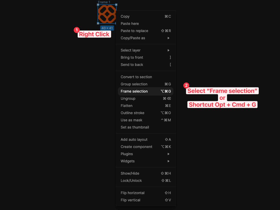
Frames are utilized to group or define boundaries to elements and arrange them into a single unit.
Figma Frame is like an artboard. Every element inside the Frame is positioned but is constrained by its size, position, and behaviour.
Frames are helpful when working on a project that requires a consistent layout.
1.2 What is the Figma Auto Layout?
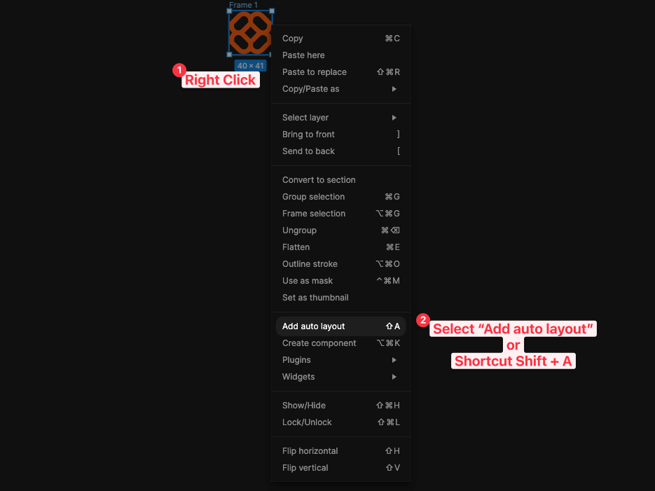
Figma Auto Layout allows you to create and adjust frames quickly. It also provides accurate spacing between objects, making design more efficient.
This saves designers time and effort manually rearranging objects for each breakpoint.
1.3 What is the Figma Section?
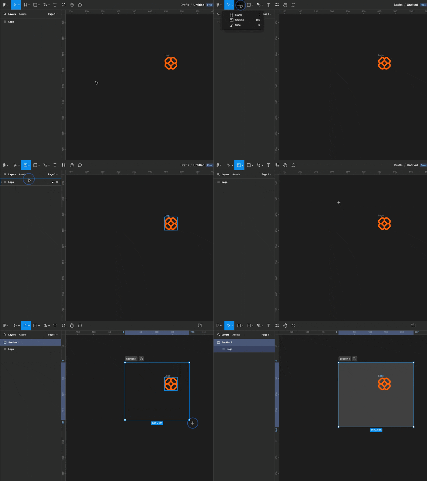
One of the benefits of the Figma Section is more straightforward navigation and organization of your design files.
Labelling frames and organizing them into sections lets you quickly locate specific elements and streamline your workflow.
Additionally, the prototyping capability within the Figma Section enables you to create interactive and clickable prototypes for user testing and feedback.
1.4 Figma Group
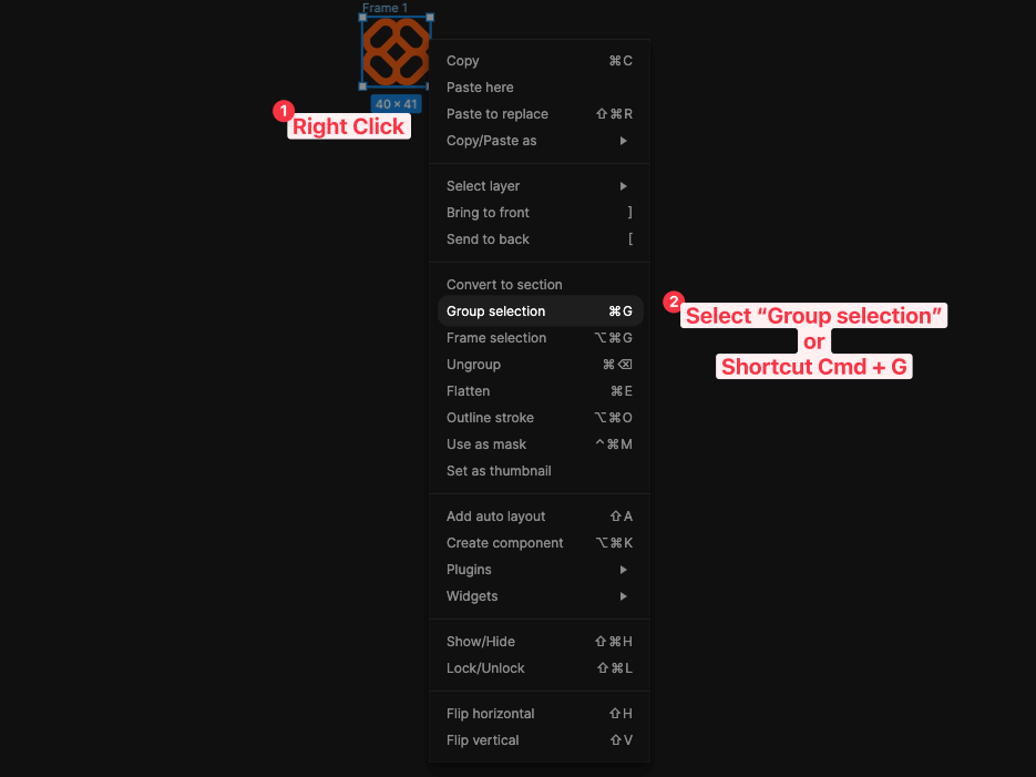
Unlike Figma Frames, which define boundaries and constrain elements in size and position.
Figma Groups do not have specific size dimensions. They are more flexible and allow elements to position themselves freely without constraints.
However, like Frames, Groups can be resized and scaled. They can also be configured with rounded corners and shadows. Groups can be nested within other groups and contain assets such as images, text, and shapes.
2. Using the Selection Tool
You can select and manipulate multiple elements, even if they are not grouped or located close to each other.
You can quickly create a selection by holding down the Shift key and clicking on different elements. You can simultaneously resize, reposition, or apply styles to all selected elements.
Once you've selected the items, you can change the colors, fonts, sizes, constraints, etc.
3. Utilizing Constraints and Auto Layout
It is essential to use constraints and auto layout to unlock the true potential of Figma for managing multiple elements.
3.1 Taking Advantage of Constraints
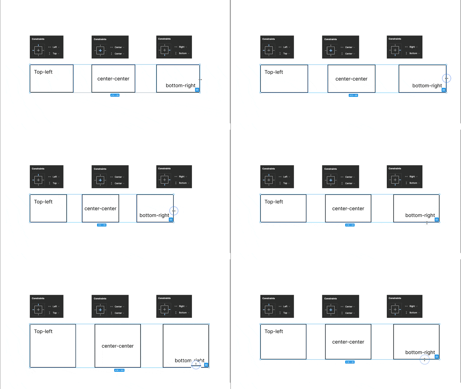
It allows you to define how elements behave when the frame is resized, ensuring consistency and responsiveness across your design.
You can specify how elements should behave when resizing the frame, ensuring the design remains consistent and responsive.
You can maintain the desired layout and proportions by setting constraints on width, height, and position. This Is even when the frame is adjusted. This saves designers time and effort by automatically adapting the design to different screen sizes and orientations.
3.2 Taking Advantage of Auto Layout Utilities
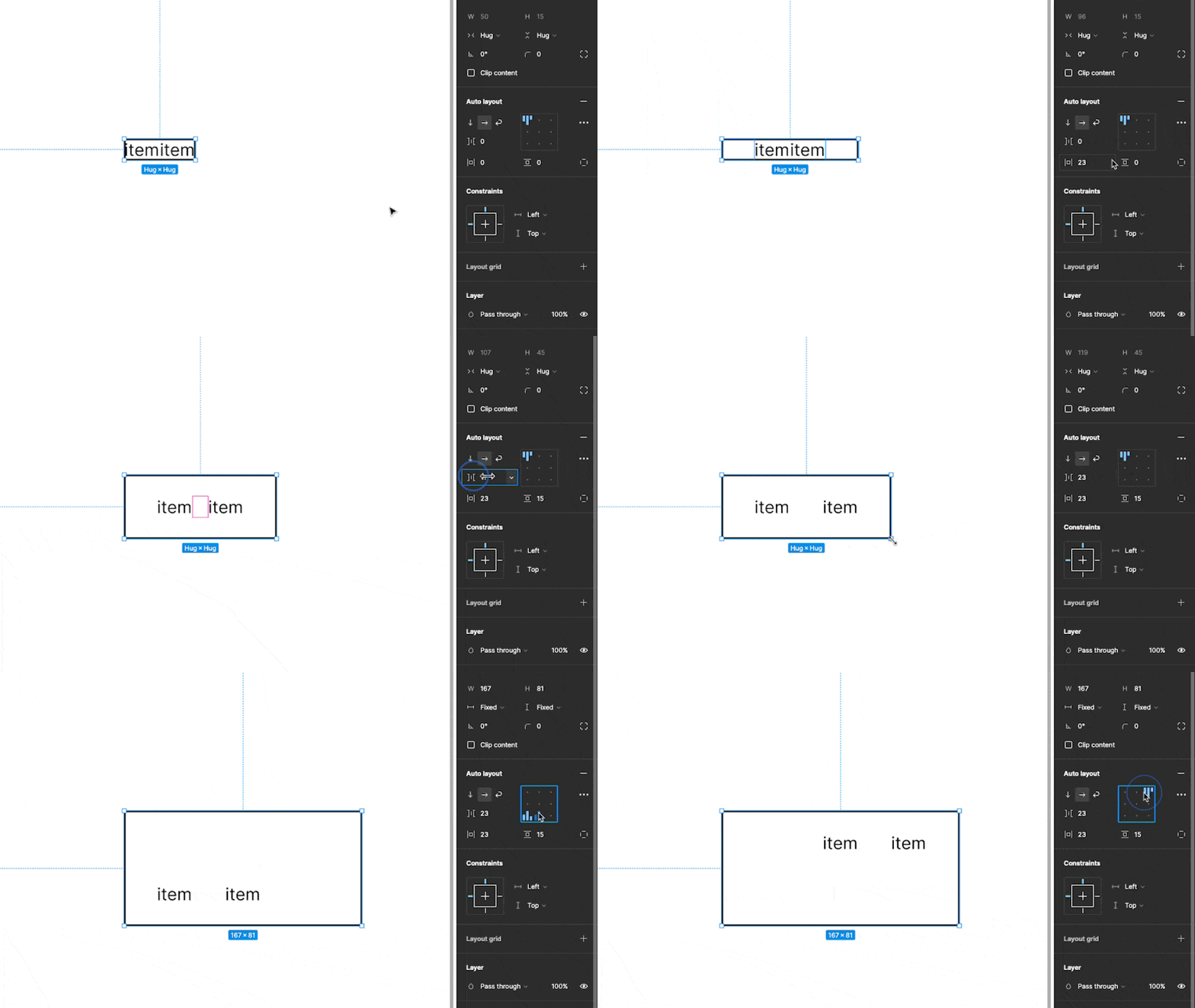
Auto layout automatically arranges and resizes elements inside it. This saves you from manually adjusting each element. You add spaces around it or add gaps between elements inside it.
4. Keyboard Shortcuts for Efficiency
When managing multiple elements, Figma offers a lot of keyboard shortcuts that can save you time and make your workflow more efficient.
You can easily navigate between layers, duplicate elements, and perform various actions without constantly switching between your mouse and keyboard.
Conclusion:
Designers should be able to manage multiple elements in Figma to optimize workflow and save time.
By leveraging grouping and organizing techniques, utilizing the selection tool, harnessing constraints and auto layout, and making the most of keyboard shortcuts, designers can streamline their work and focus on the creative aspects of their designs.
Embrace these strategies, and watch your productivity soar as you unlockFigma's true power.